Core: A Sharp Gothic Display Typeface for Bold Brand Moments
I opened a fresh brand board last week for a local ceramicist’s studio refresh—minimal palette, tactile paper stocks, quiet confidence. Her work is hand-thrown, imperfectly elegant, and deeply intentional. She didn’t want “cute” or “trendy.” She wanted presence. So I dropped Core onto her logo draft—not as a default, but as a quiet experiment. And right away, something clicked.
What Core Actually Feels Like in Real Work
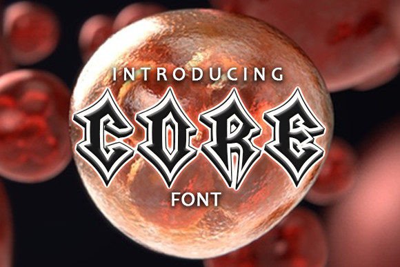
Core is a sharp gothic display typeface—no soft edges, no apologies. It’s got that classic gothic structure (think sturdy verticals, tight apertures, strong contrast), but with a contemporary edge: tighter spacing, slightly exaggerated terminals, and a subtle tension in the strokes that reads as both confident and quietly rebellious. It’s not distressed or grungy—it’s clean, controlled, and precise. That precision is what makes it feel premium, not costume-y.
I tested it across six real touchpoints: the logo lockup, a folded business card, matte-finish packaging labels, a website hero banner, an Instagram carousel headline, and a small-run poster series. In every case, Core held its own—not as background filler, but as a deliberate statement. On the ceramic studio’s matte black box label, for example, the font’s sharp serifs caught just enough light to add dimension without needing foil or embossing. On the website header, it scaled cleanly from desktop down to tablet—though I’d skip it below ~32px. It’s built for impact, not endurance.
Where Core Shines (and Where It Steps Back)
Core is a display font through and through—and it knows its role. It excels where you need instant recognition and mood-setting: logos, signage, posters, social banners, product names on packaging, editorial headlines, and limited-run merch. Its personality lands fast: serious, grounded, artfully assertive. It helped the ceramicist’s brand feel more intentional—not louder, just *clearer*.
That said, it’s not a workhorse. Don’t use it for body copy, ingredient lists, multi-paragraph web text, or anything smaller than 24–28px in print or 32px online. The tight apertures and sharp angles start to blur at smaller sizes, especially on lower-res screens. And while it adds gravitas to a boutique skincare line’s product name, it would feel jarringly intense on a children’s book cover or a nonprofit’s annual report title page. It’s selective—not universal.
It also doesn’t pretend to be neutral. If your client’s brand voice is warm, folksy, or gently minimalist, Core may over-index on intensity. It works best when the brand already carries some weight—handmade goods, independent publishing, avant-garde fashion, dark-toned beauty, or studio-based creative services.
How It Pairs (and Why That Matters)
I paired Core with two fonts across the project: a warm, low-contrast serif (like Tiempos Text) for body copy and captions, and a restrained geometric sans (like Inter or Manrope) for subheads and functional UI text. The contrast worked beautifully—the gothic sharpness of Core gave hierarchy instant authority, while the supporting fonts kept things legible and approachable.
For script or handwritten accents? Use sparingly—and only if they’re equally refined. A loose, bubbly script will clash hard with Core’s control. But a tight, monoline script (think something like Neue Haas Unica Script) can complement it elegantly in a monogram or signature line.
One note: Core ships with one weight (Bold) and includes standard OpenType features—ligatures, alternate characters, and basic multilingual support (Latin Extended-A). No italics or light variants—but that’s fine. Its strength is focus, not flexibility. If you need a full family, pair it intentionally rather than stretch it thin.
A Few Practical Notes Before You Commit
First—always check the license. Core is a commercial font, and its license covers desktop use, web embedding (with proper @font-face setup), and basic print. But if you’re building templates for resale, designing merchandise for drop-shipping, or licensing assets to clients for unlimited use, verify the terms. Some display fonts restrict extended commercial use unless upgraded.
Second—test early, test physically. Drop Core into your actual mockups, not just a font menu. Print a business card at 100% scale. Load it on your staging site and scroll on mobile. See how it sits next to photography, texture, and color. Its sharpness can amplify contrast—or create unintended visual noise—if not balanced thoughtfully.
Finally, remember: Core isn’t about being everywhere. It’s about being unforgettable in the right moment. Used with restraint, it gives your brand a distinct silhouette—one that lingers, not because it shouts, but because it stands still, steady, and unmistakably itself.